The wedding stationary and wedding day designs for the marriage of Jackie Church to Brendon O'Leary.
When my sister asked me to design her wedding invitations, I was simultaneously ecstatic and nervous. I knew that this would be my most important project ever.
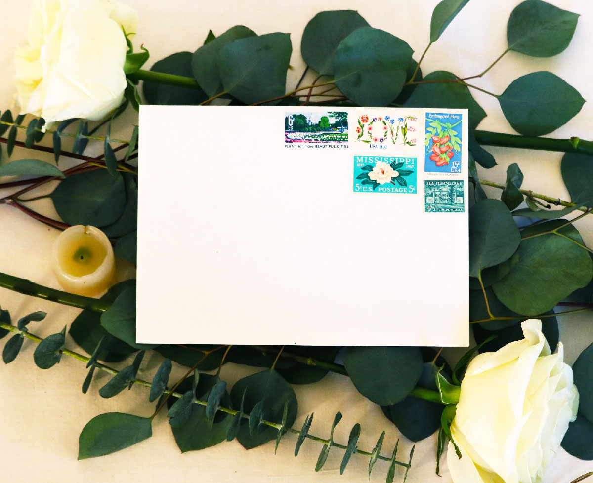
We started early on by discussing her ideas for the wedding, color scheme, dress, and everything in between. Jackie and Brendon came to their decisions together of course (#relationshipgoals), but Jackie was mostly in charge of the vision for the wedding. She is the embodiment of modern elegance with a large helping of mischievousness. We are Catholic, so the wedding would take place in the Church with a reception to follow. All these factors led us to the key ideas for the wedding visuals: a mix of very traditional elements with modern minimalism. The color scheme: white and green (in the form of greenery), with the possibility of an extra accent color.
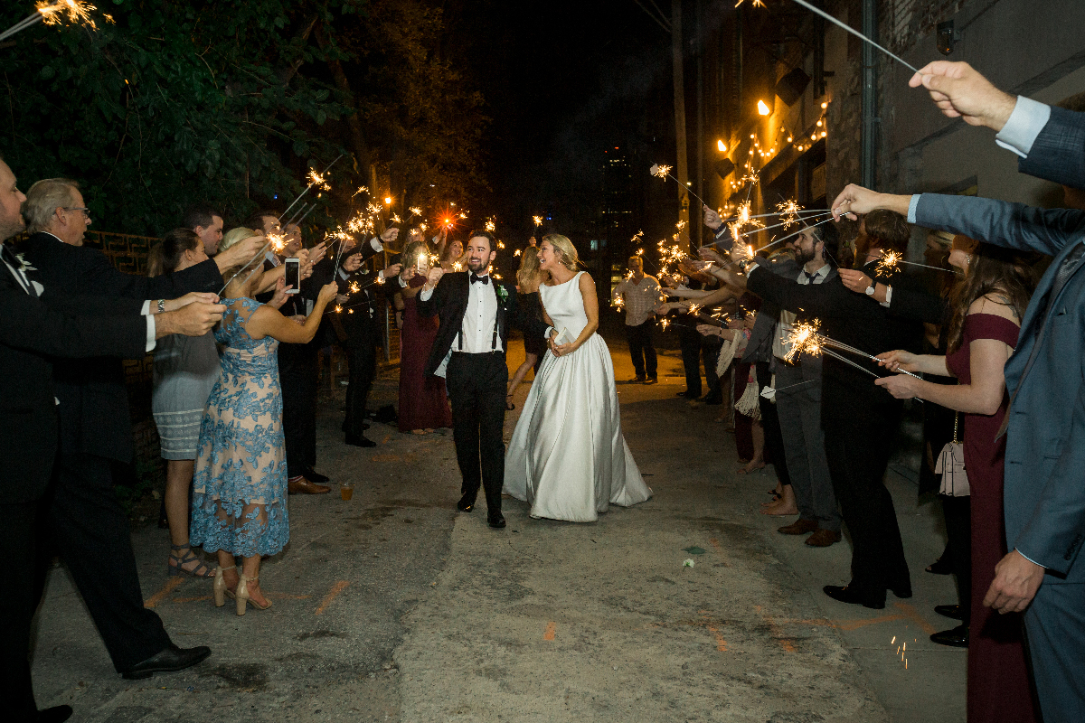
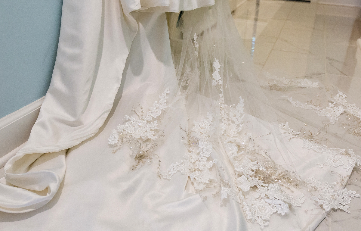
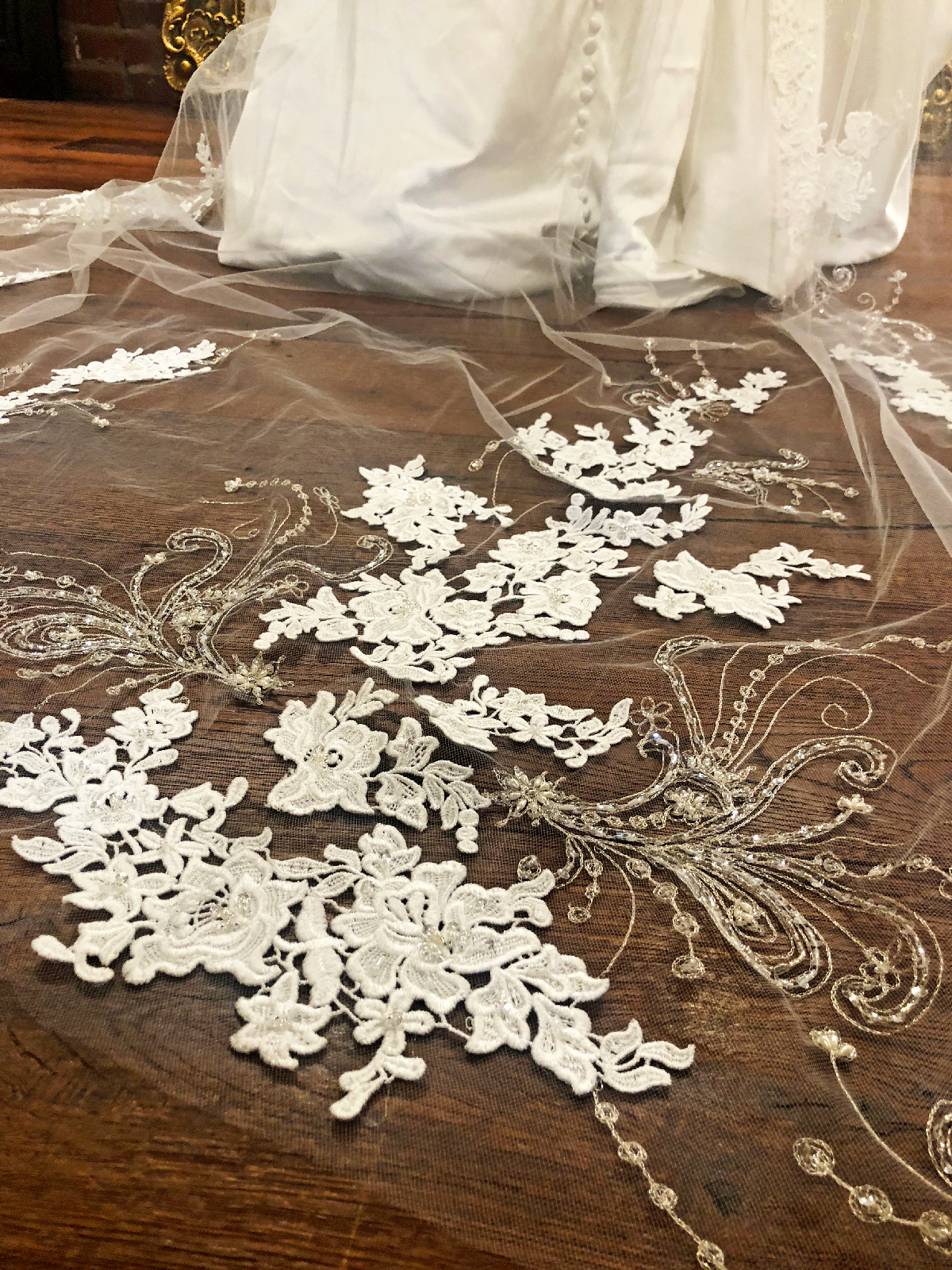
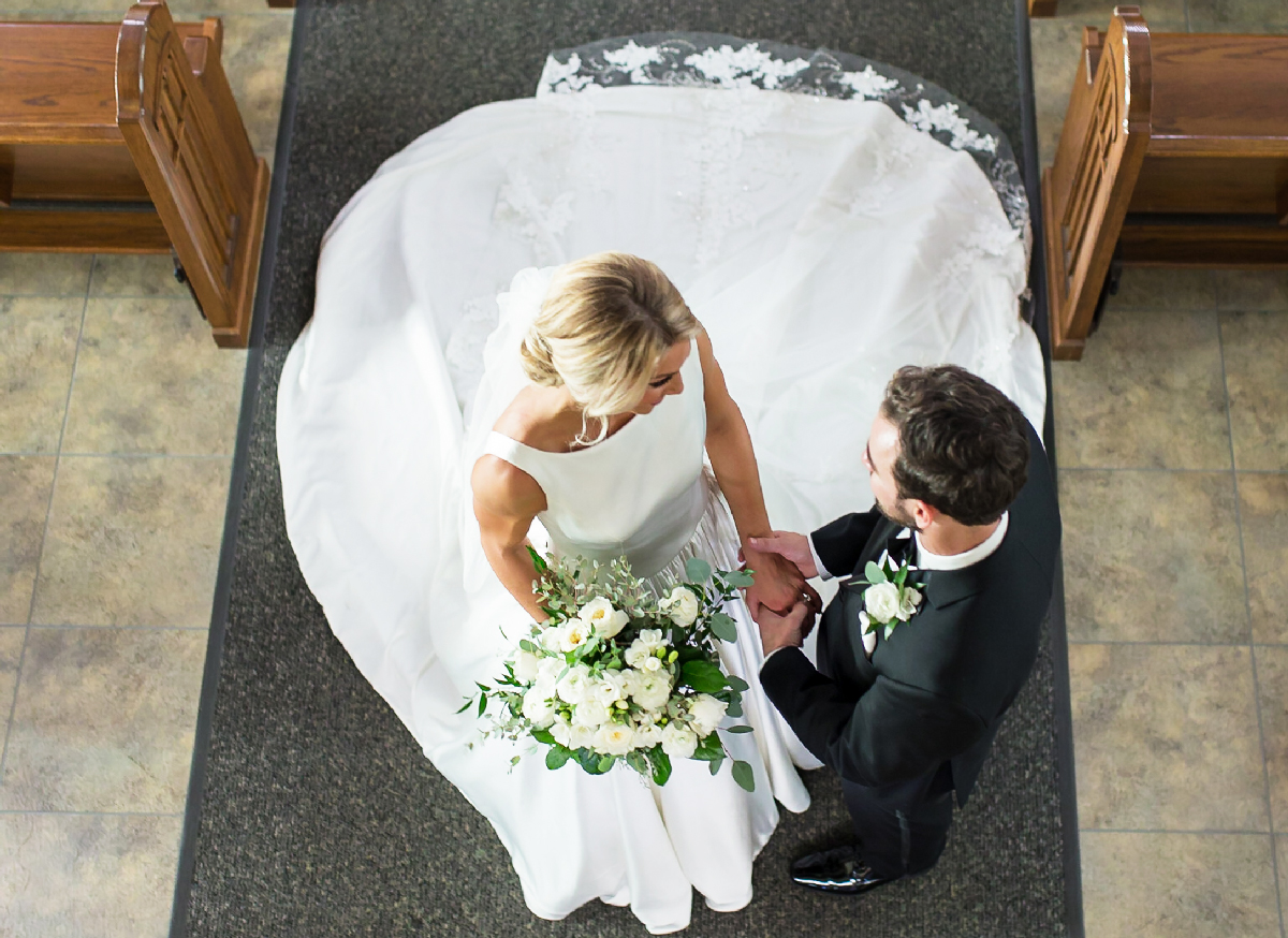
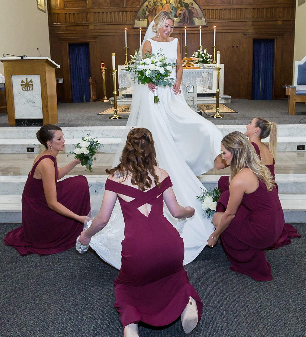
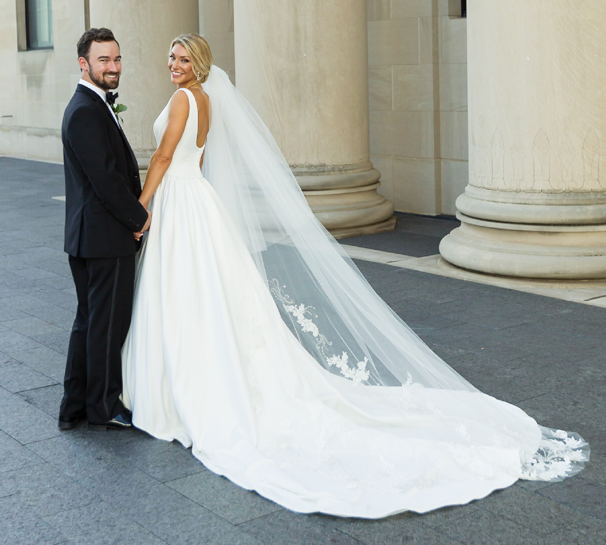
The dress became the inspiration for everything else. The dress was a mix of everything that she wanted: a structured bodice without frills, large and flowing skirt with an extra long train (I promised to carry it everywhere), buttoning down the back and the length of the skirt, and every inch covered in the most beautiful satin you’ve ever seen or felt. A dress for a modern queen, custom made by the one and only Emily Hart. The only question: what would the veil look like? I had the answer ready to go. The veil had to be at least as long as the dress’s train and it had to have some lace and bling to contrast the smoothness of the silk (plus every bride needs a little lace, am I right?). The veil was just longer than the train, with immaculately spun lace and beading accents. Put all that on the most beautiful woman ever, and no one could hold their tears back. Nothing could match up to Jackie in that dress, but I wanted the invitations to compliment her, the relationship between Brendon and Jackie, and everything the day of the wedding would bring.
All wedding day photography courtesy of Jodi Vander Woude Photography
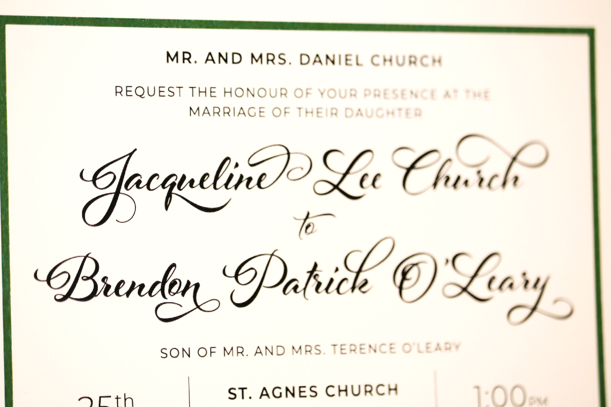
The invites had to be personal and something she couldn’t find anywhere else. I originally wanted to design the script that we would use:
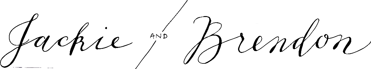
I wasn’t happy with anything that I was doing, so I turned to the expert: Laura Worthington. She is a typeface designer and my favorite script designers. I scoured through her creations until I found the right one:
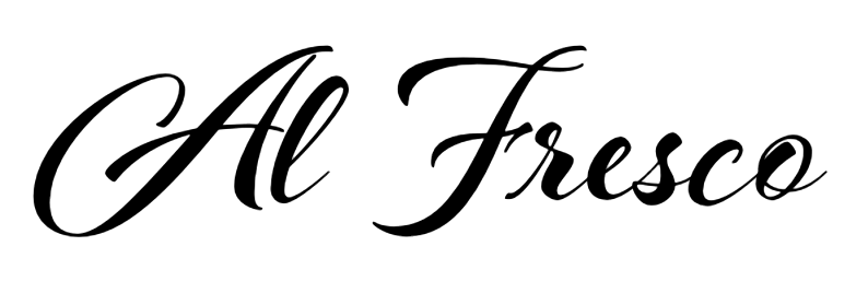
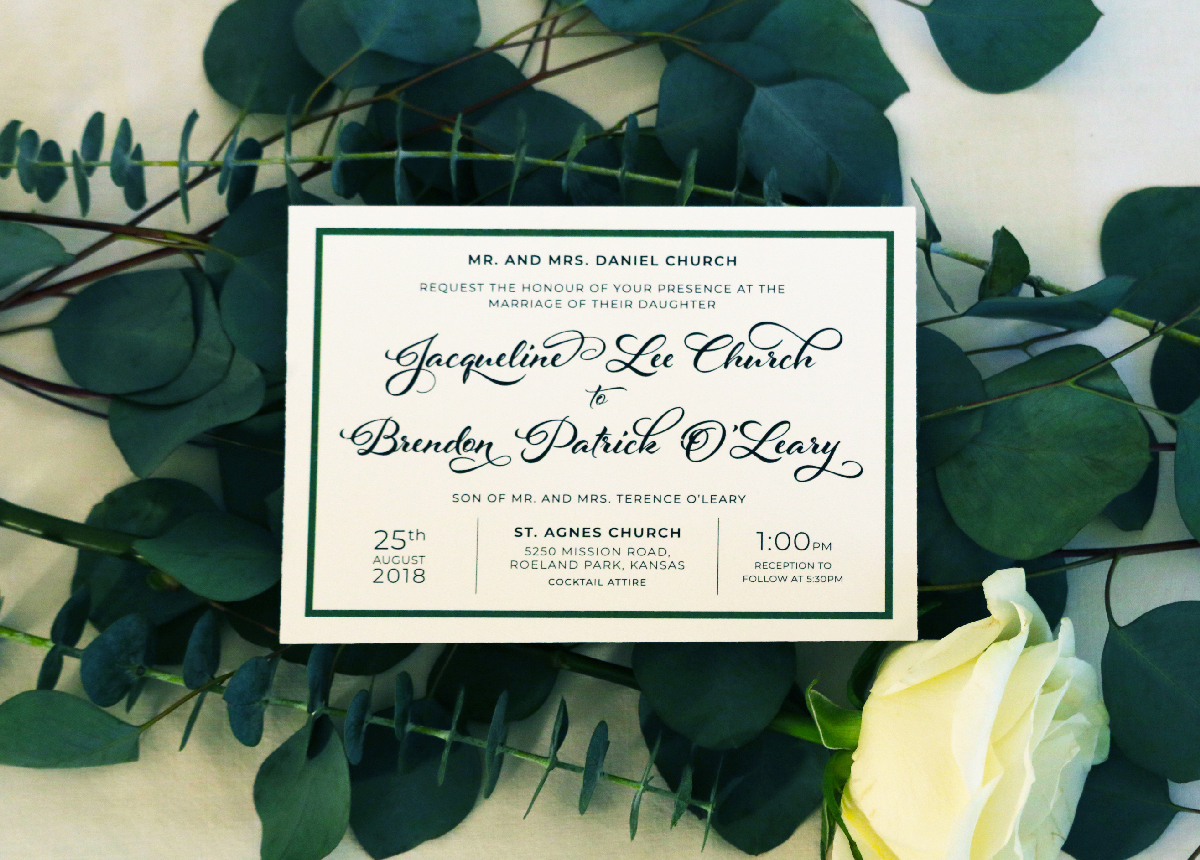
Al Fresco is a breezy, light, expressive typeface perfect for packaging products and titling. Al Fresco is versatile; when titling is activated, the loops are removed from the lowercase letters, giving the typeface a cleaner aesthetic and more contemporary feel. When contextual alternates are activated, the ending strokes become minimized, offering a more natural look—a special touch that reveals the warmth and uniqueness of the human hand.
It’s structure and consistency give it a traditional calligraphy feel, but the swashes, letter shapes, and dramatic weight shifts bring both fun and modern feeling. The beauty and speciality of this typeface called for it to be used sparingly. The script was a nod to a more traditional invitation, so needed to be paired with a clean, refreshing, sans serif. I chose Montserrat in all caps for the pairing.
The old posters and signs in the traditional Montserrat neighborhood of Buenos Aires inspired Julieta Ulanovsky to design this typeface and rescue the beauty of urban typography that emerged in the first half of the twentieth century.

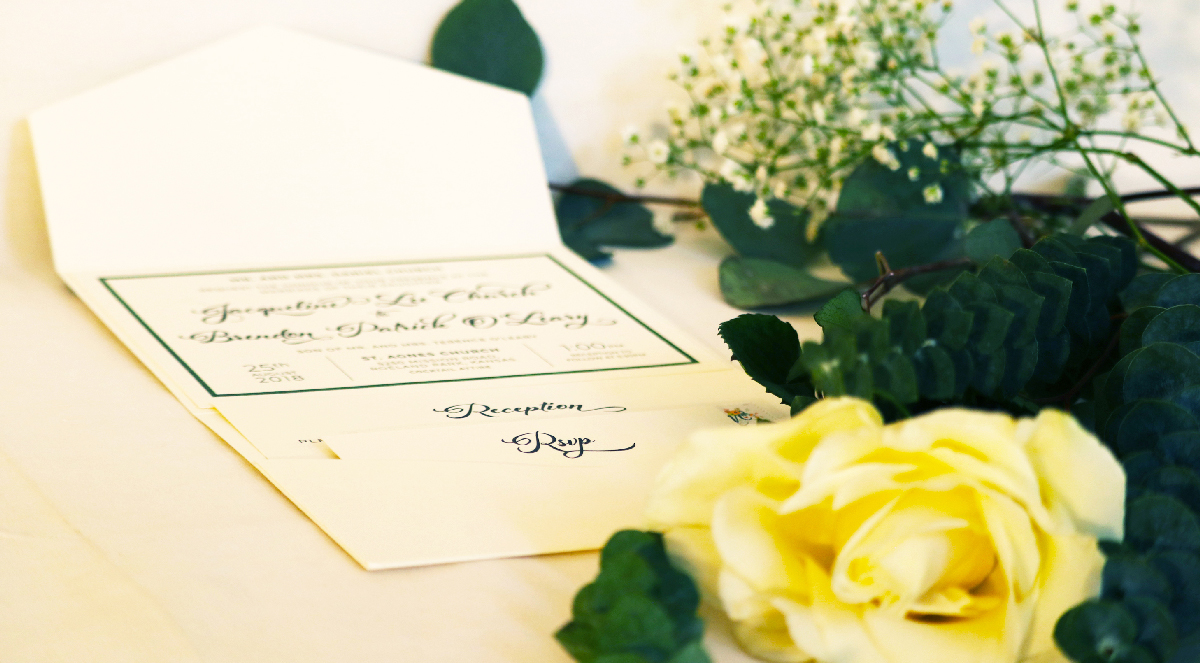
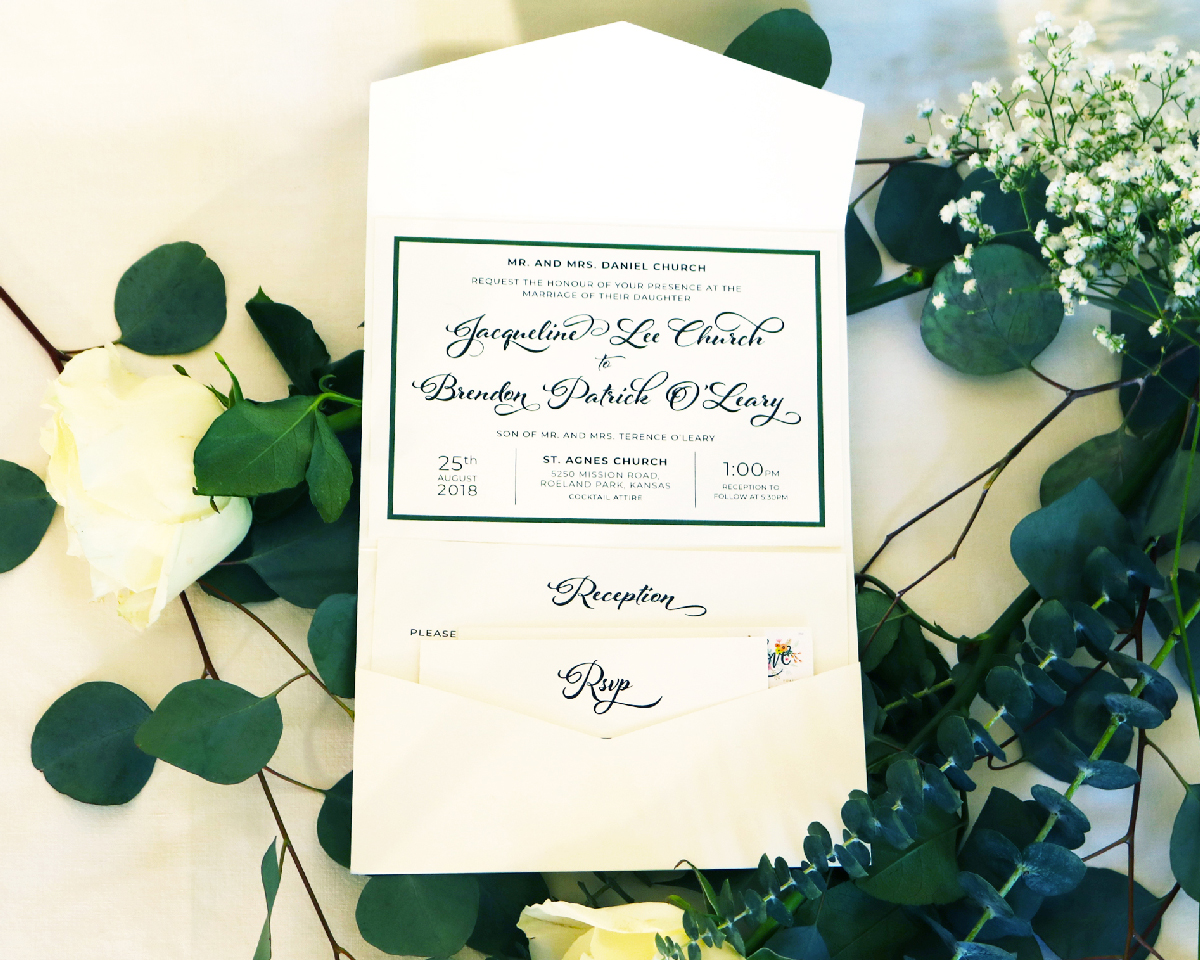
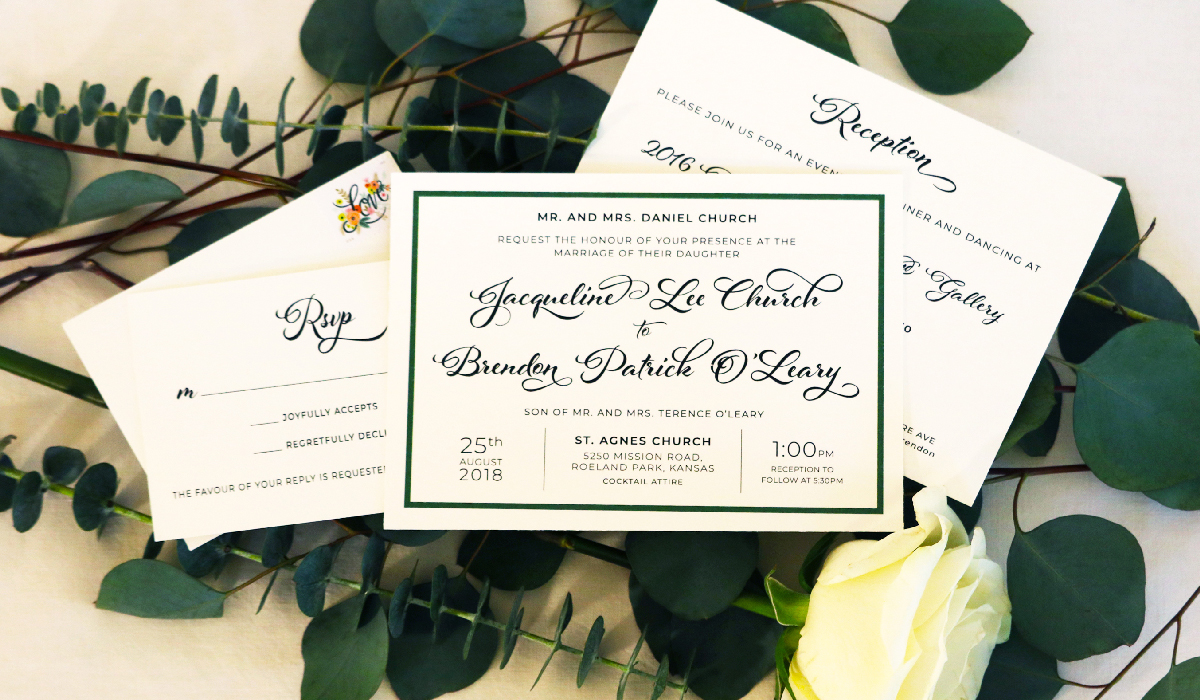
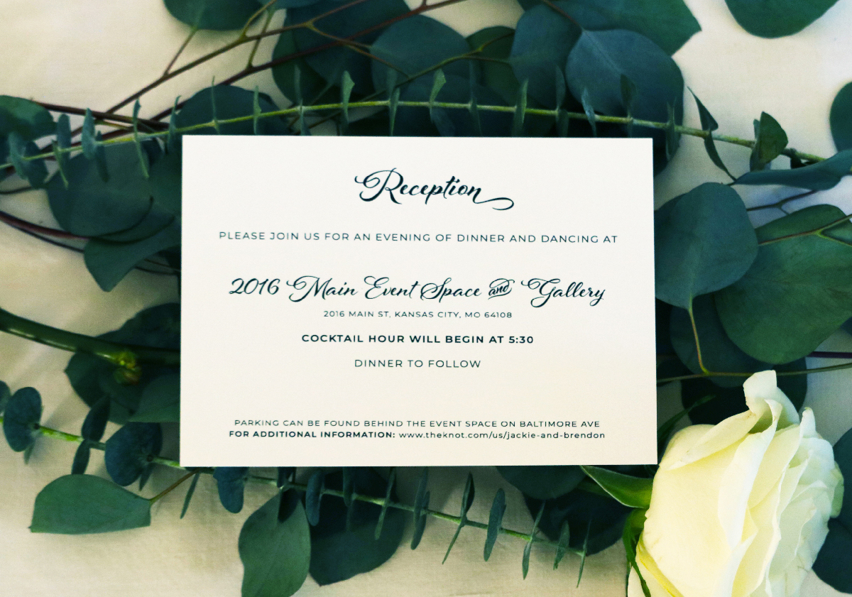
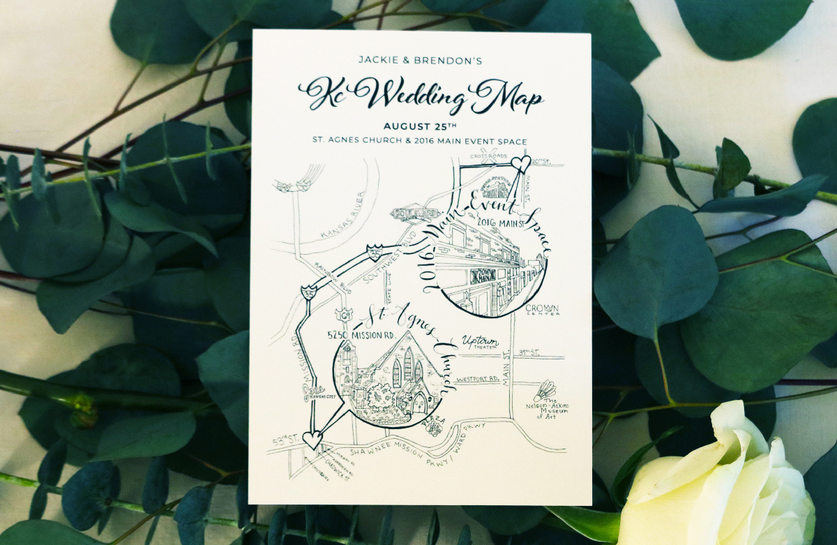
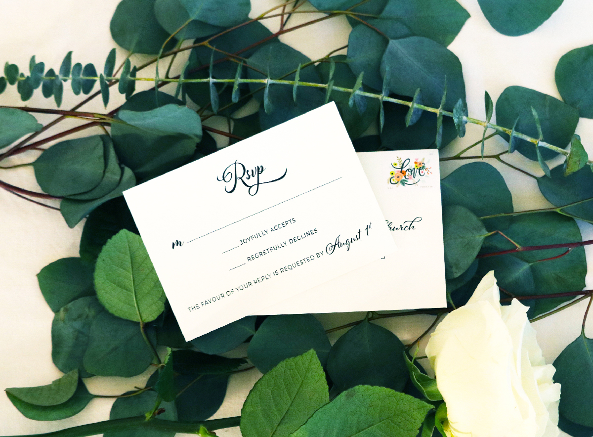
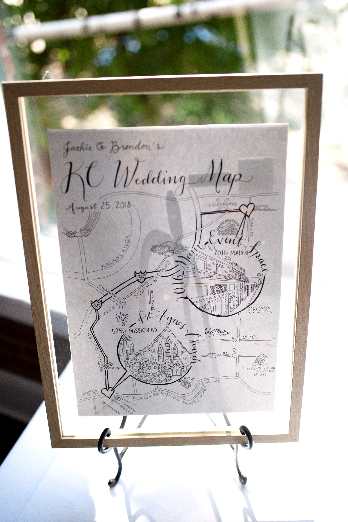
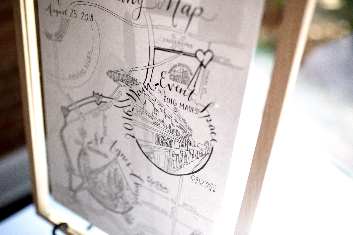
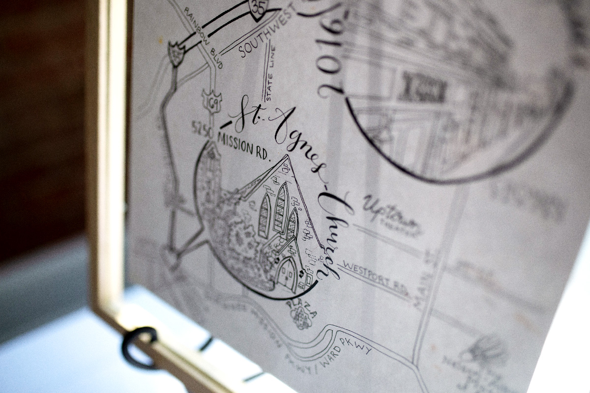
Wedding invitations don’t just include the invitation, they also include the RSVP and any other pertinent information. Jackie requested a custom map for the invitees, showing them how to get from the Church to the reception. All these pieces can be tied together or grouped together in a number of different ways. After looking at some examples at RSVP in the Village, we all fell in love with a folded inner envelope containing a pocket for the reception info/map, RSVP, and RSVP envelope. All the other pieces were designed in accordance with the invitation, save the map which was hand drawn. We worked closely with Becky at RSVP and they did a fantastic job of meeting our needs!
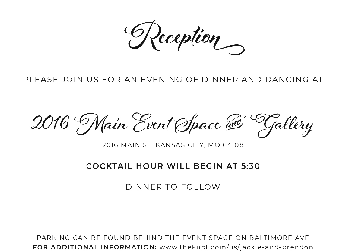

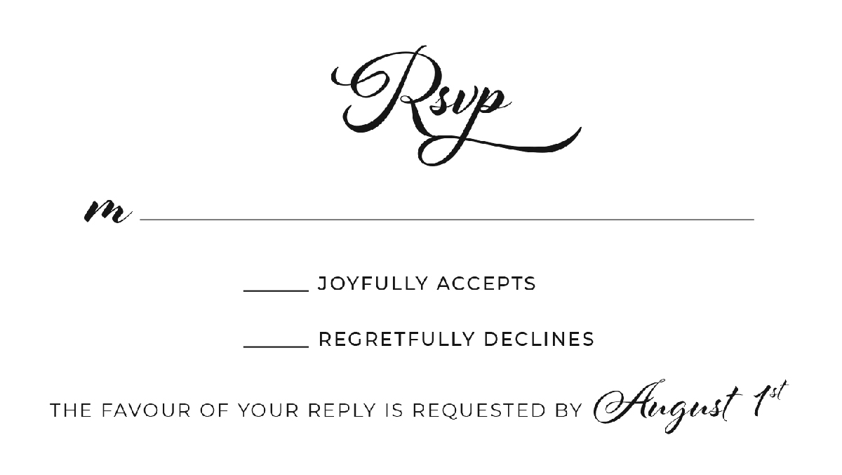
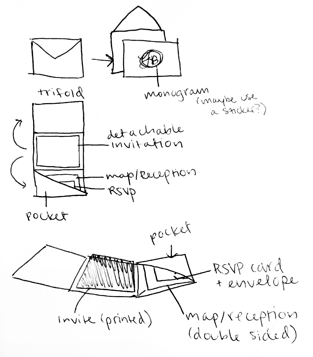
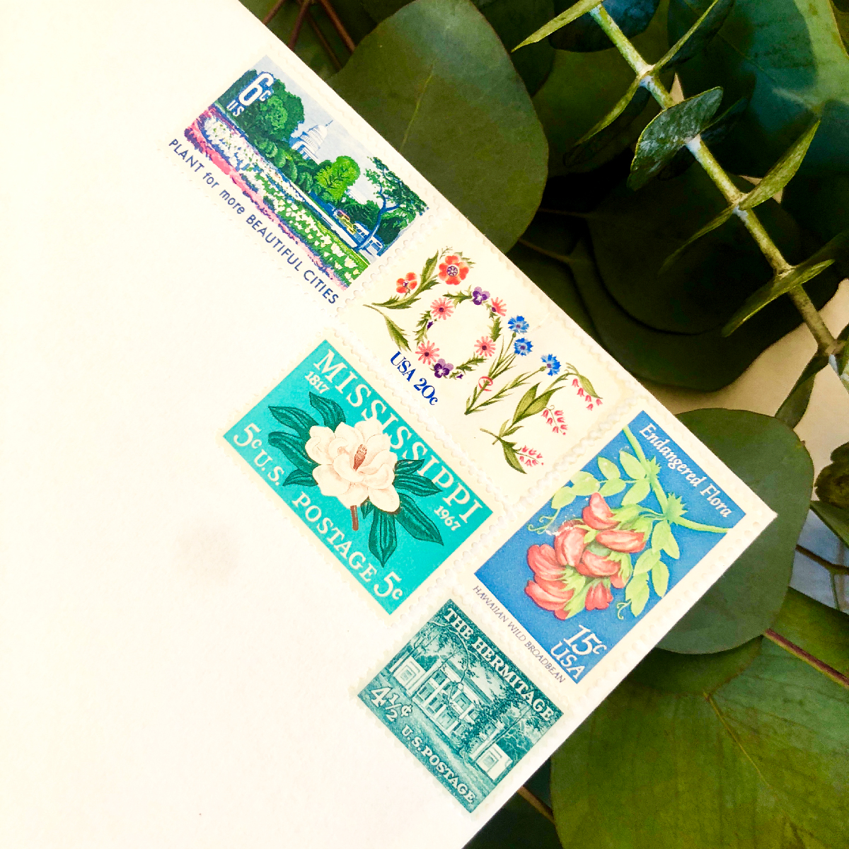
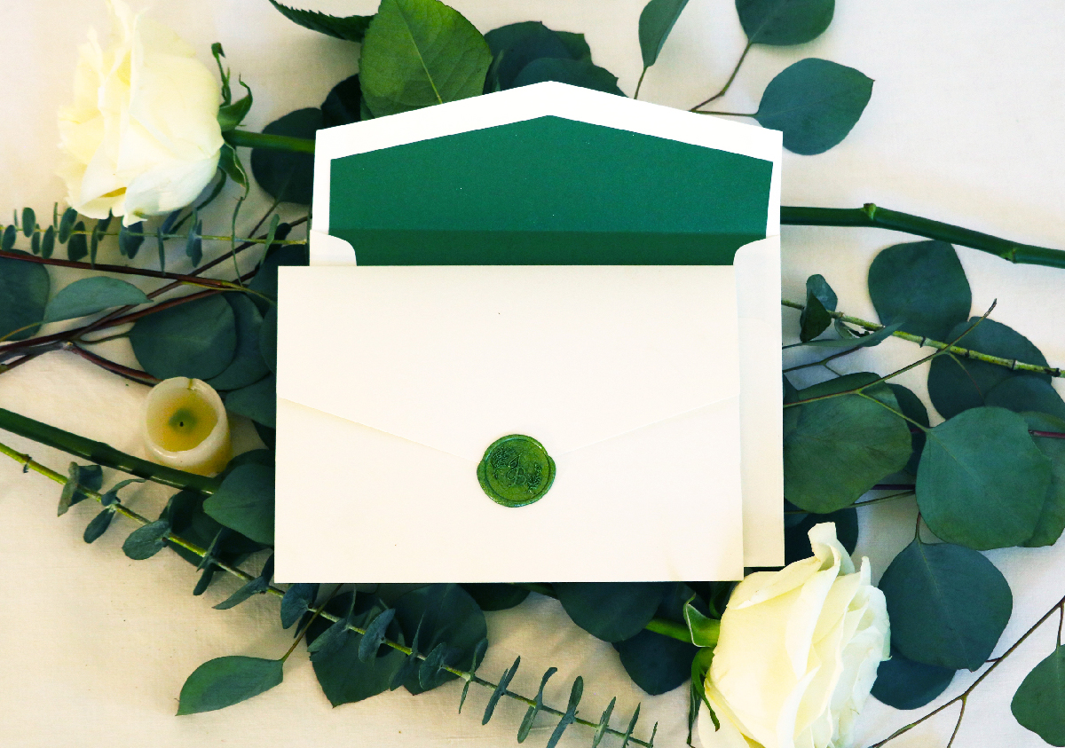
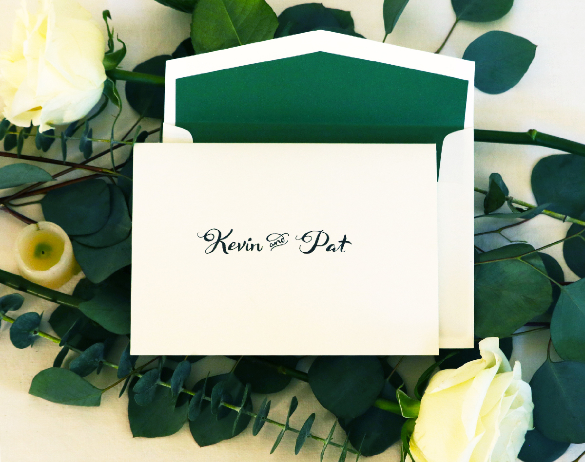
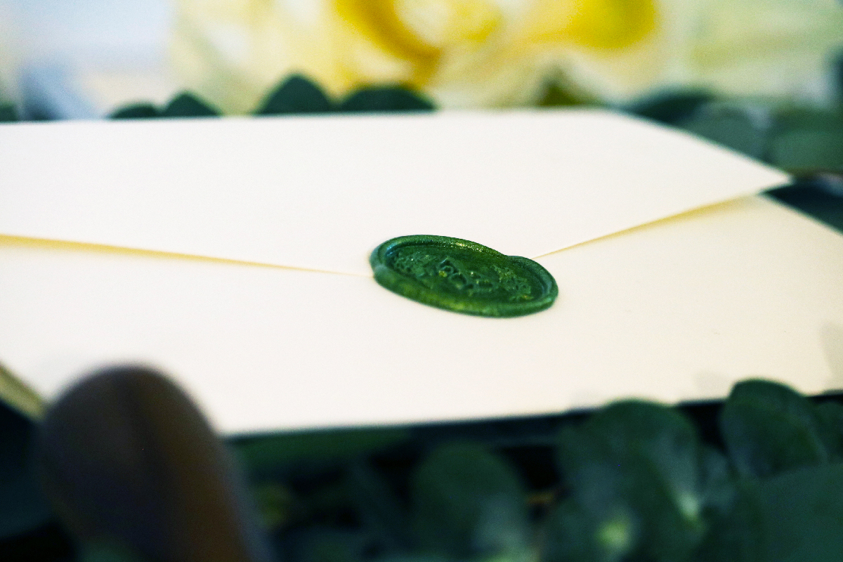
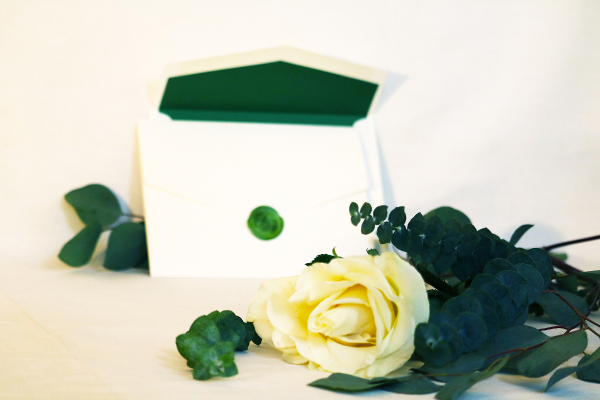
The paper was all ecru, an off-white and the type would be printed all be black. Simple and elegant as planned. But they were missing something. So, the invitation itself got a green border that was matched with a shimmering green envelope insert.
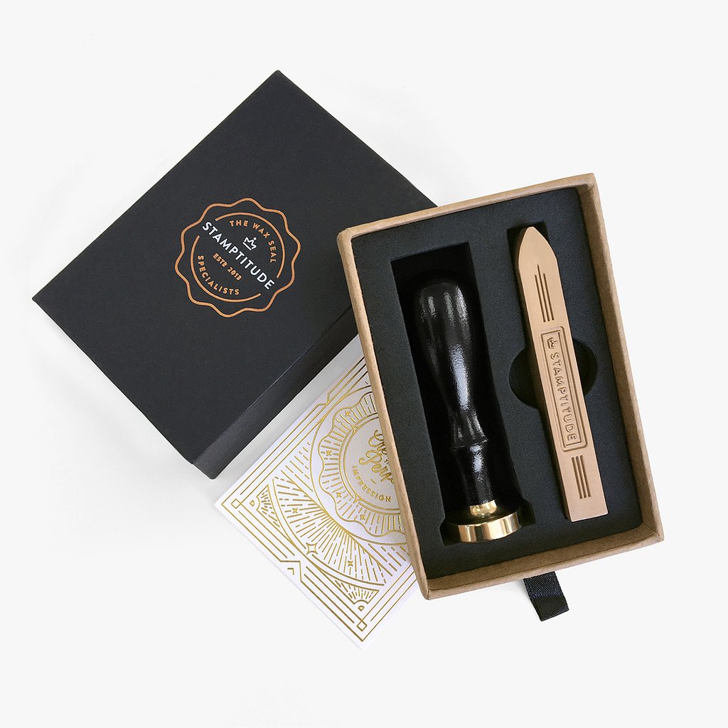
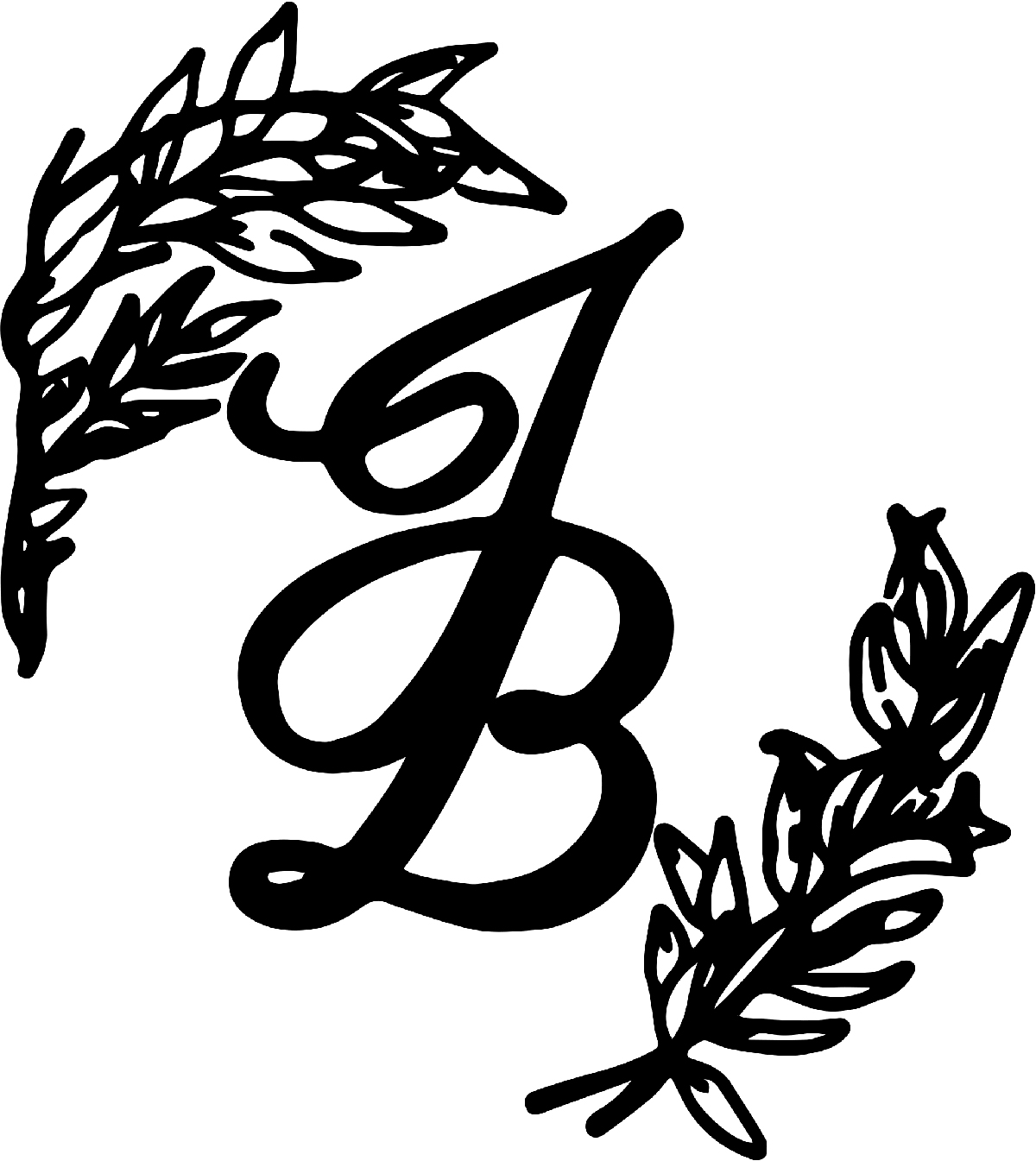
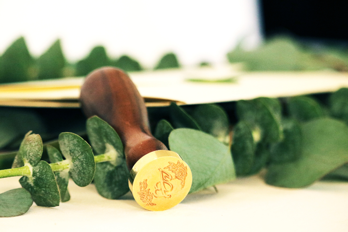
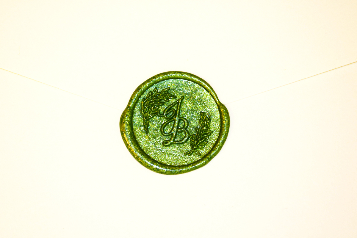
I also decided to design and order a wax seal monogram seal for the two. The seal combines the J for Jackie and B for Brendon with hand drawn greenery. (Ordered from Stamptitude)
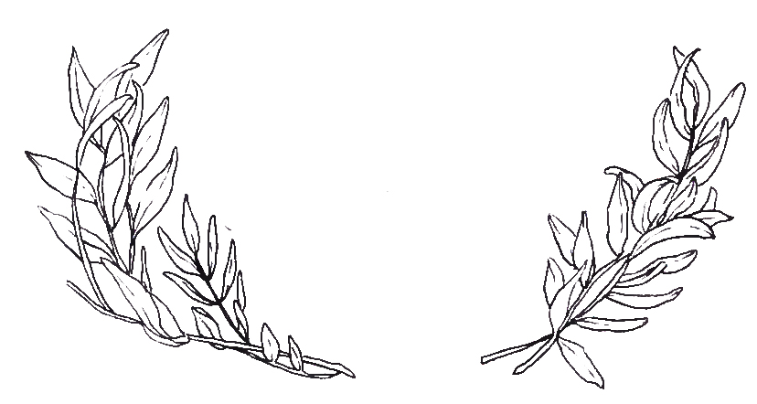
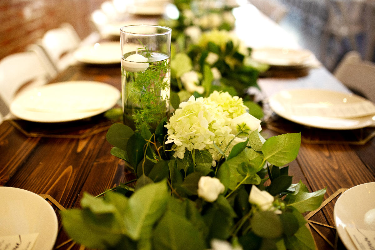
The final detail for the invitations included a silver dollar eucalyptus leaf, which was also used in Jackie’s bouquet and as a garland on the head table at the reception. The eucalpytus had the added bonus of giving the invites a fresh scent.
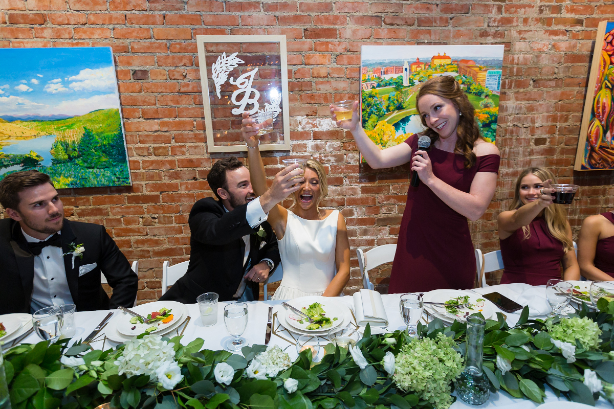
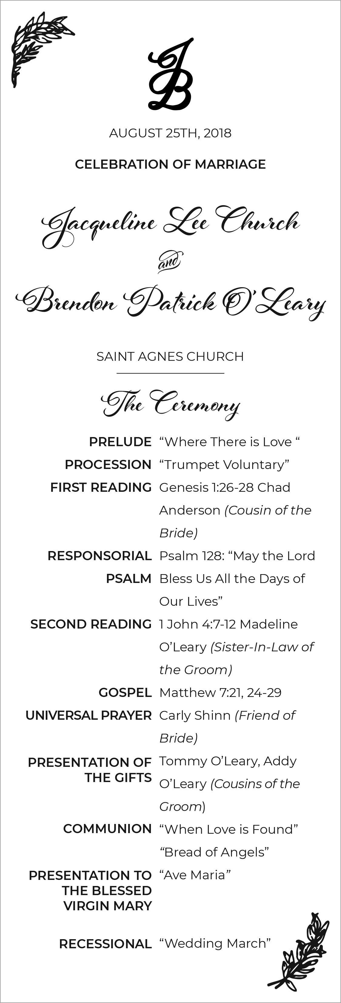
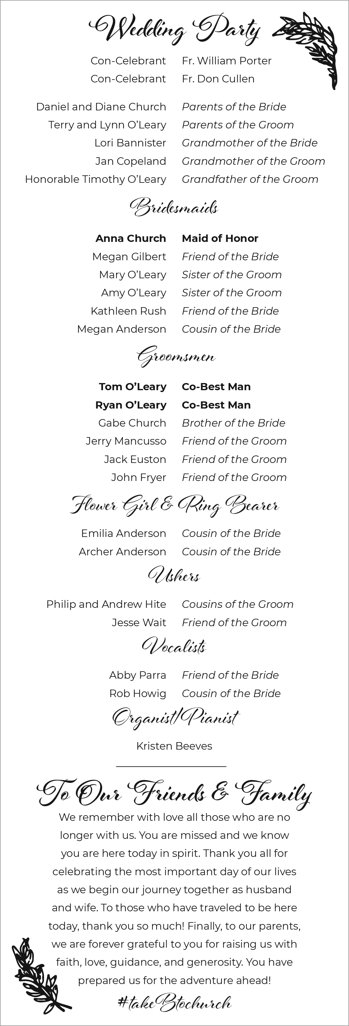
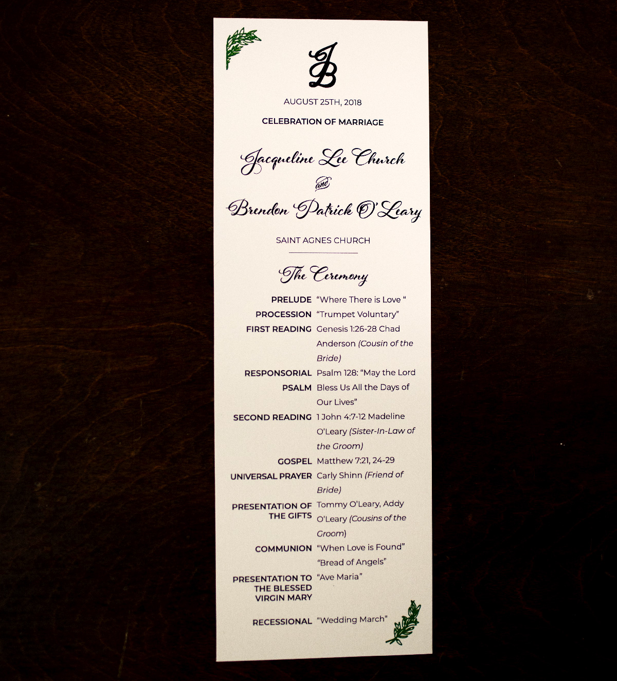
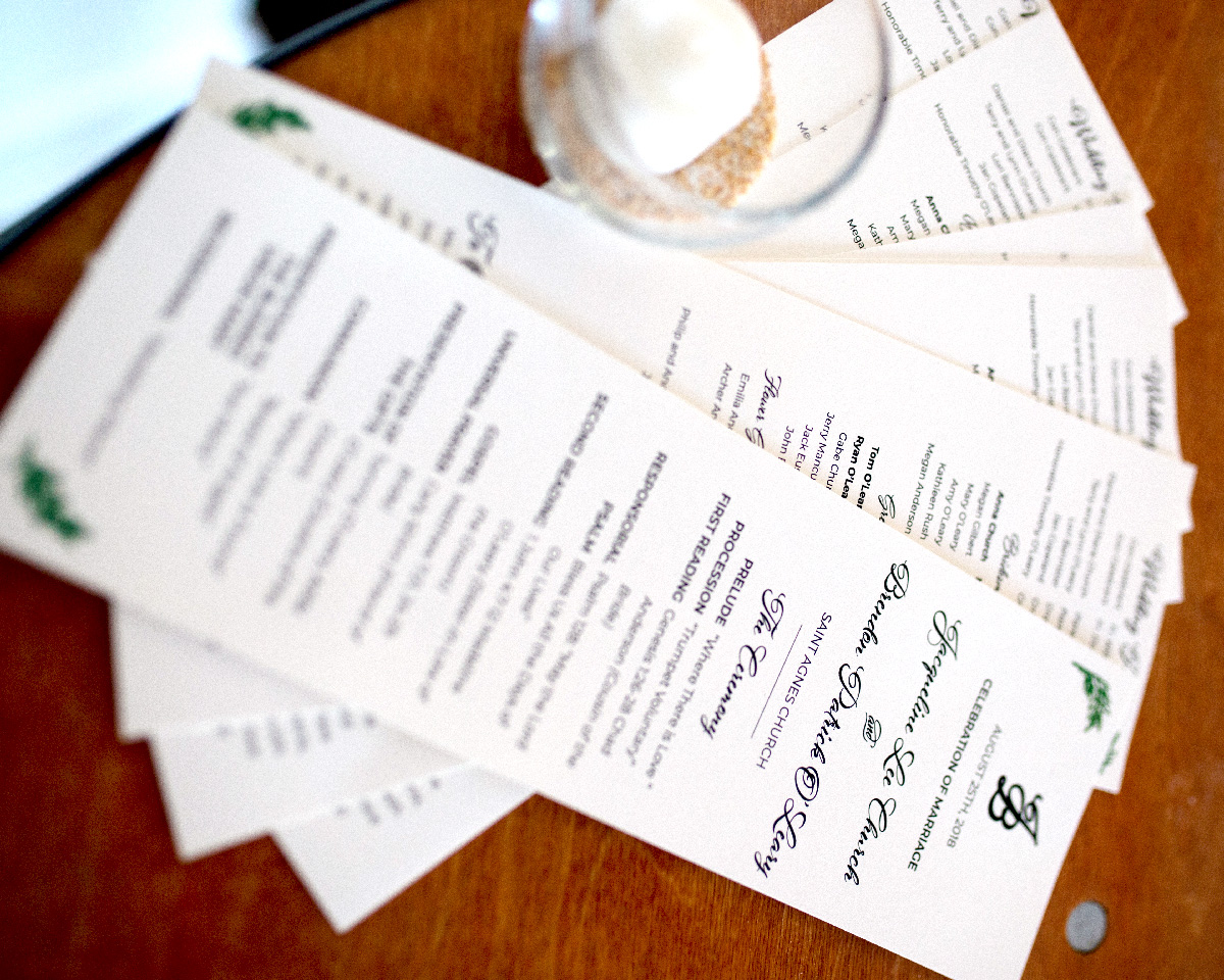
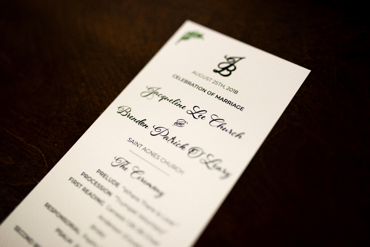
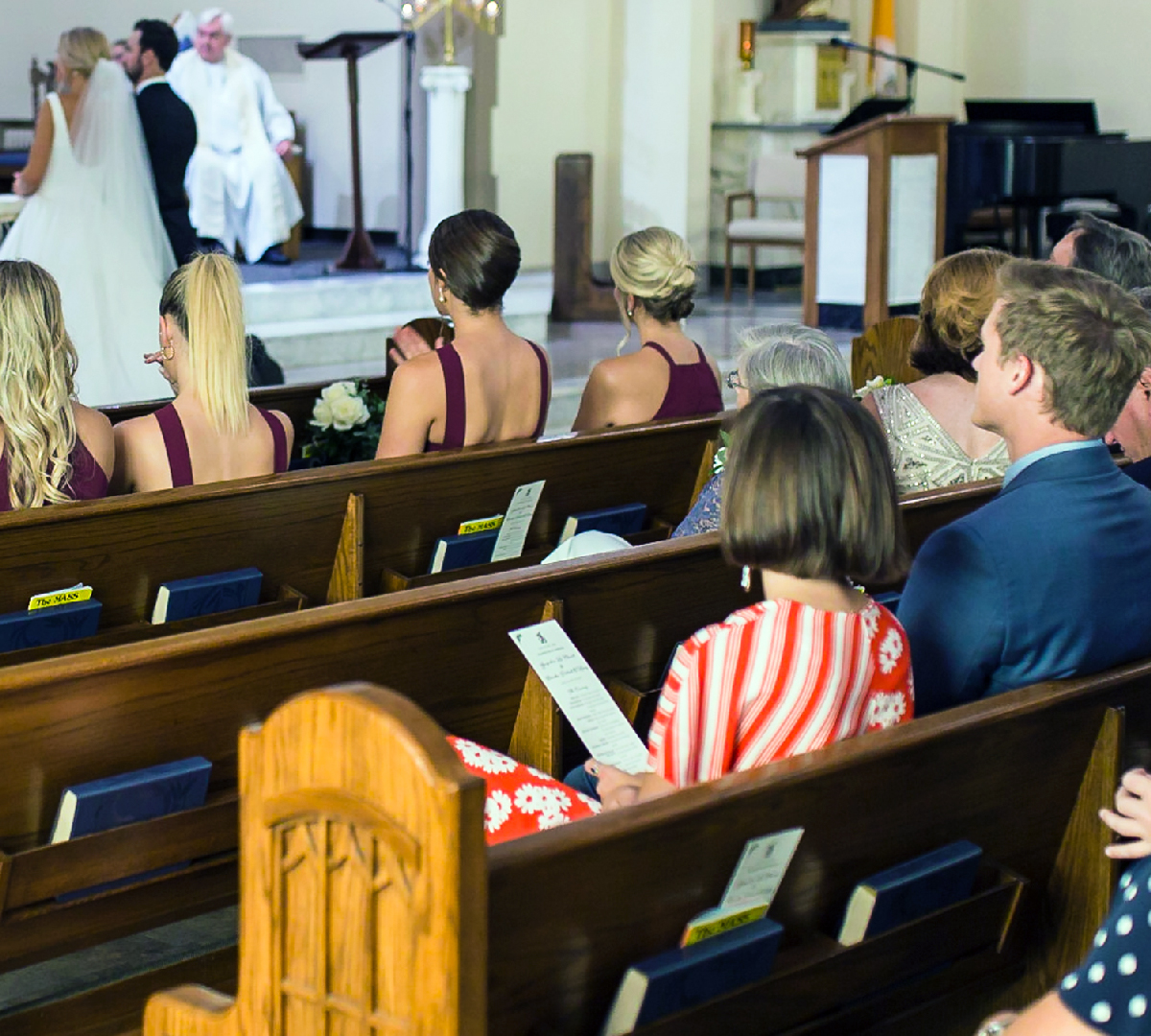
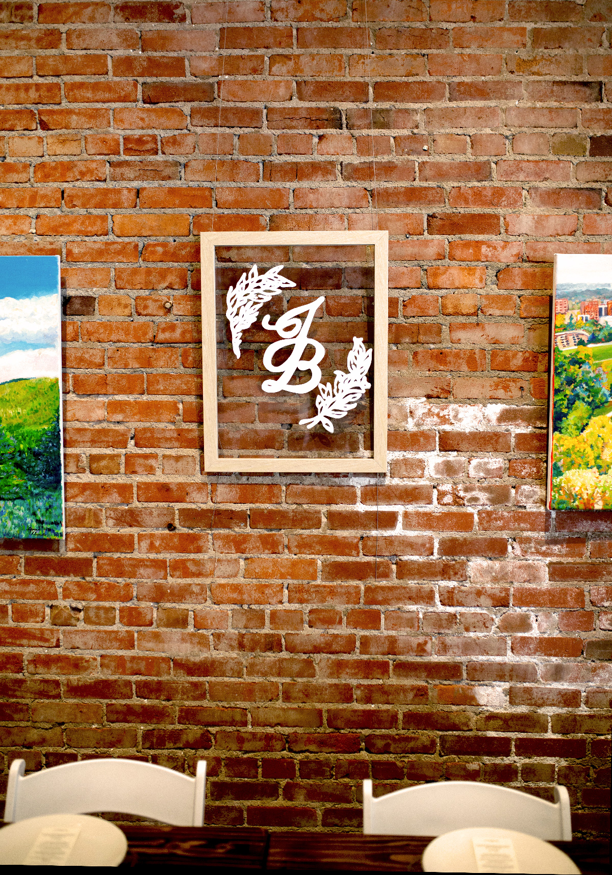
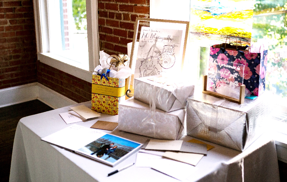
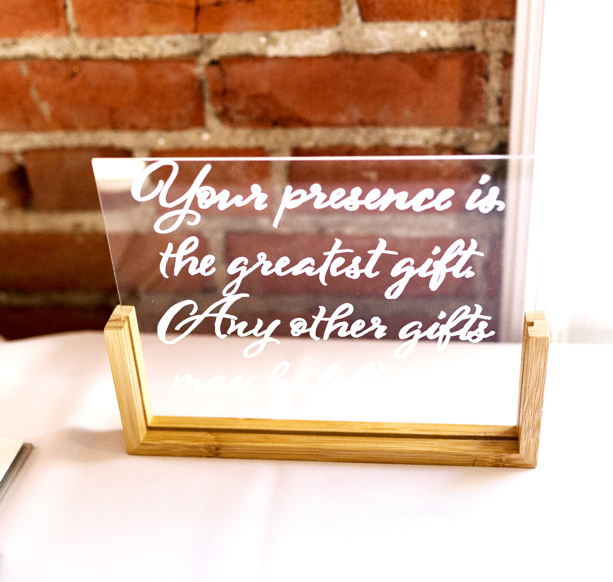
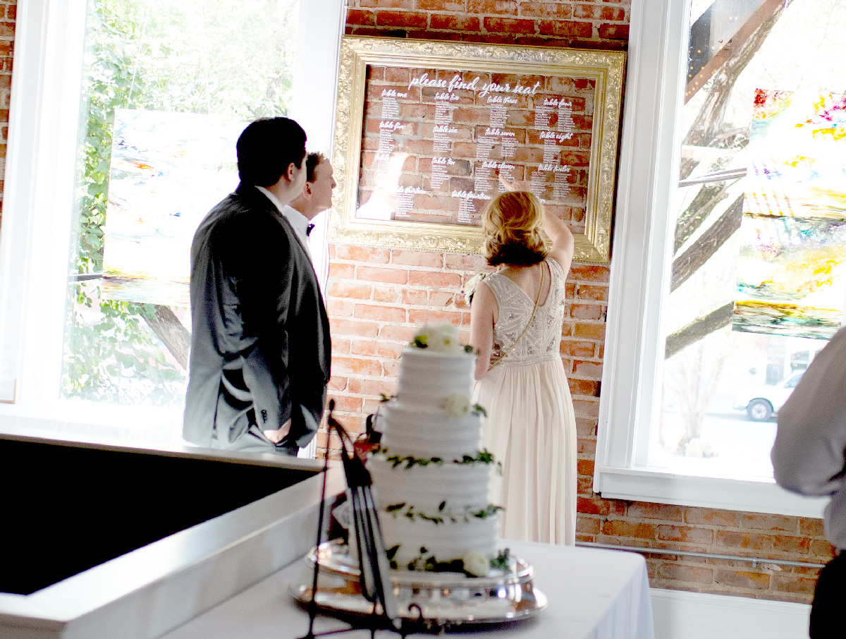
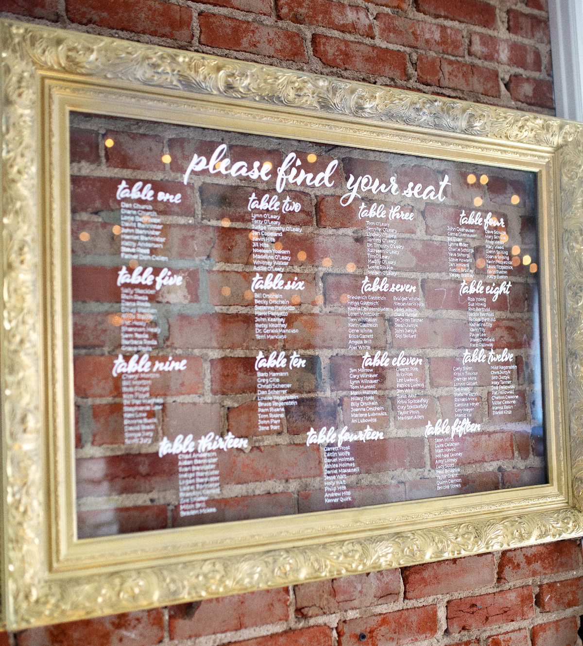
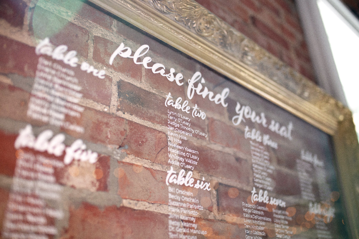
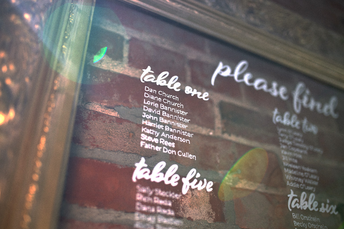
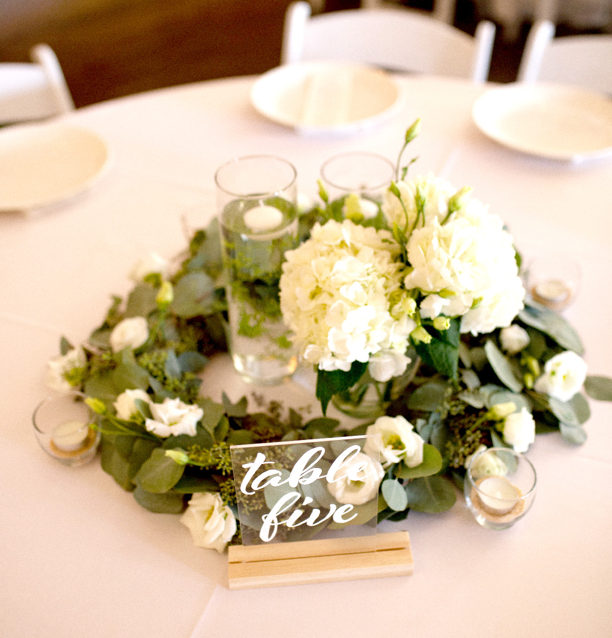
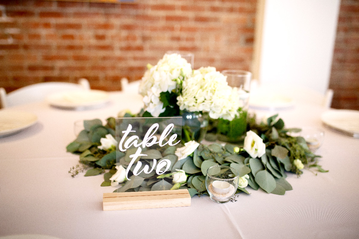
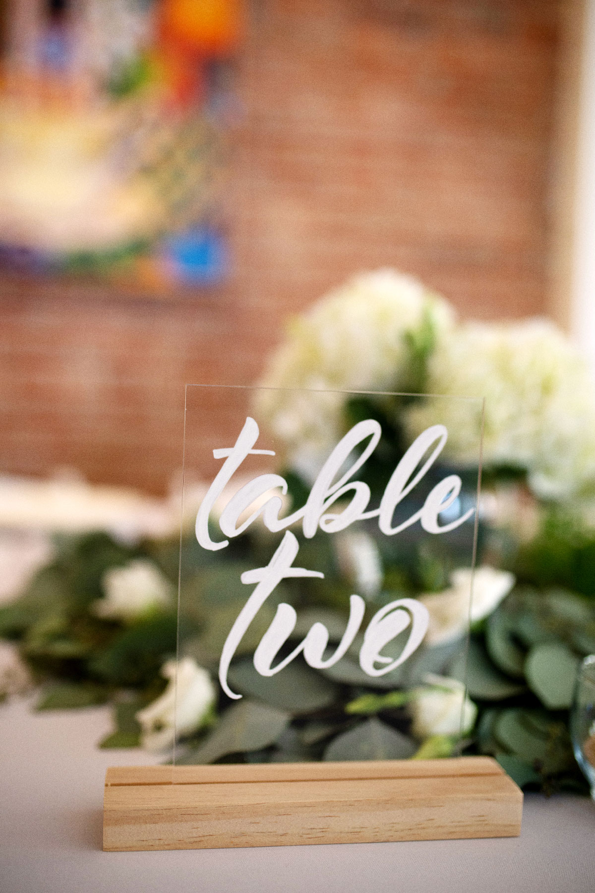
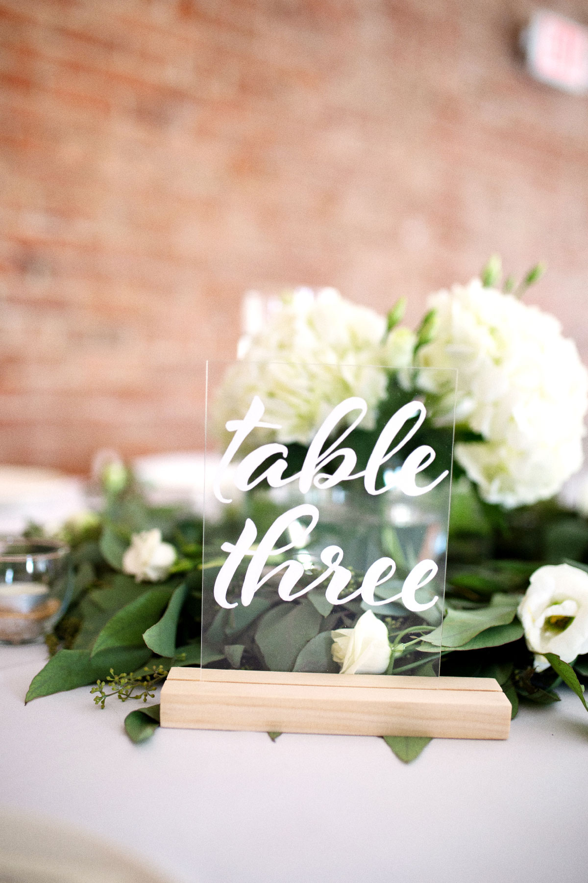
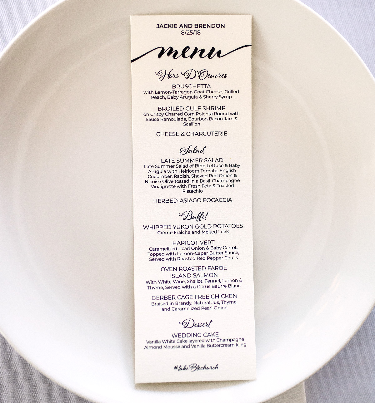
We ended up being very happy with how the invitations turned out and the invitees were also very complimentary. With the invitations completed, we could move on to the actual wedding day! Work for the actual wedding day included; the wedding mass program, menu for the reception, framing the original map drawing, seating chart, table numbers, gift table sign, and large monogram.
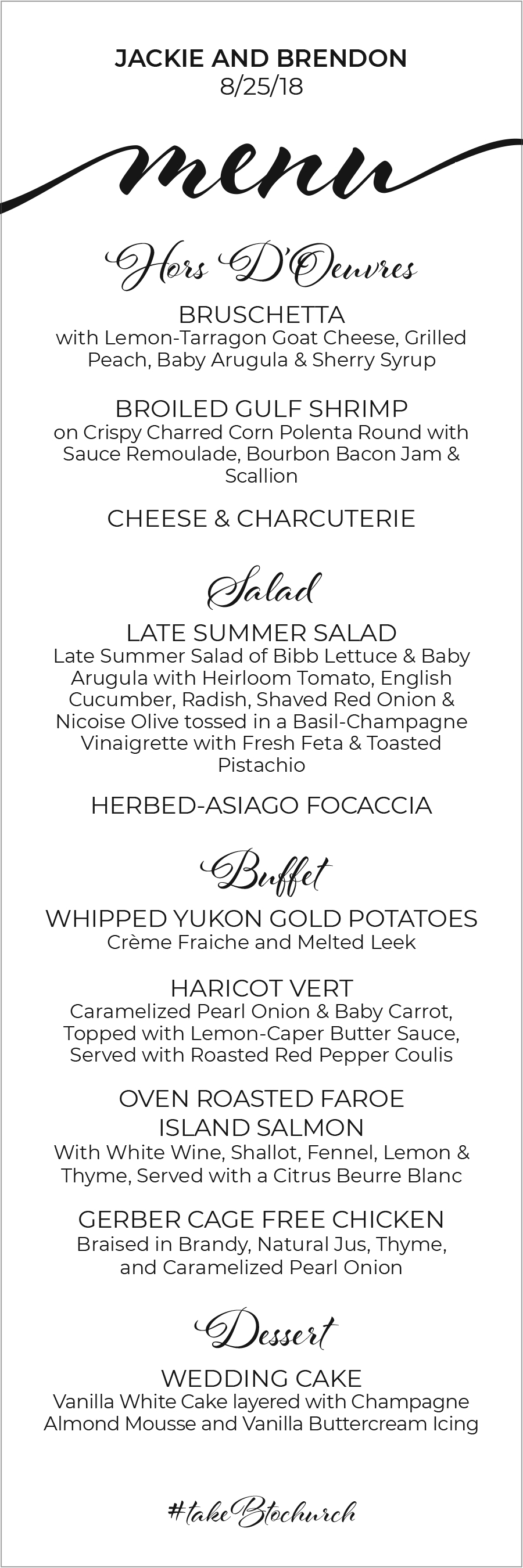
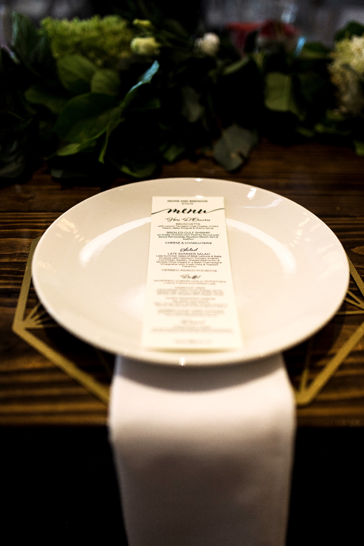
The program and menu were printed on the same paper and followed the design of the invitations to create a complete wedding stationary set.
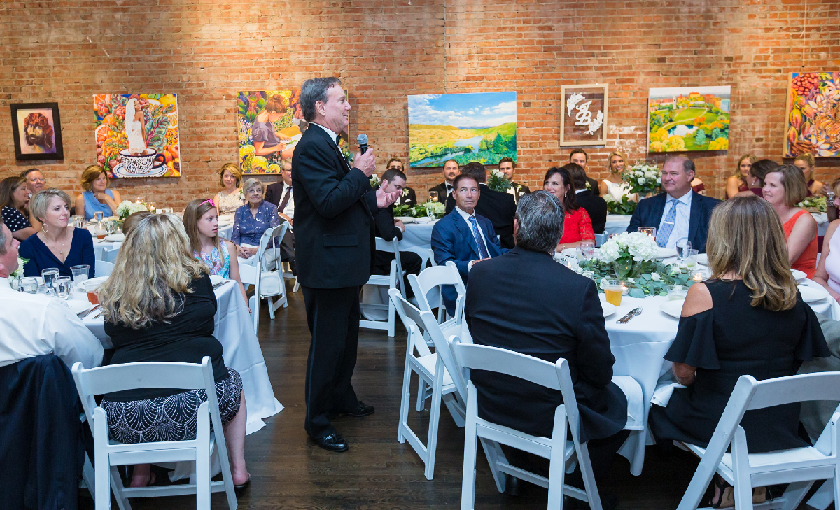
The other pieces were created on glass or acrylic using paint markers and the Al Fresco typeface. I chose to use glass to keep the minimal and modern aesthetics and place emphasis on the venu textures and table setting greenery.
Since the venu (2016 Main) doubles as an art gallery, we also had the option of using the art they had hanging or bringing my pieces in. I was originally against using my own pieces since I wanted every second of attention to be on Jackie and Brendon. However, Jackie was iffy on the the art already hanging and since she had previously commissioned a large piece for Brendon, we decided it made the most sense. It was also another personal touch for all of us to be involved in every aspect of that unforgettable day. A huge thank you to Pat and Jodi for everything!
I'm so grateful for my amazing older sister and her husband Brendon. I'm glad that I was able to contribute to their wedding and (hopefully) help make it everything they imagined. Love you Jackie and Brendon!